

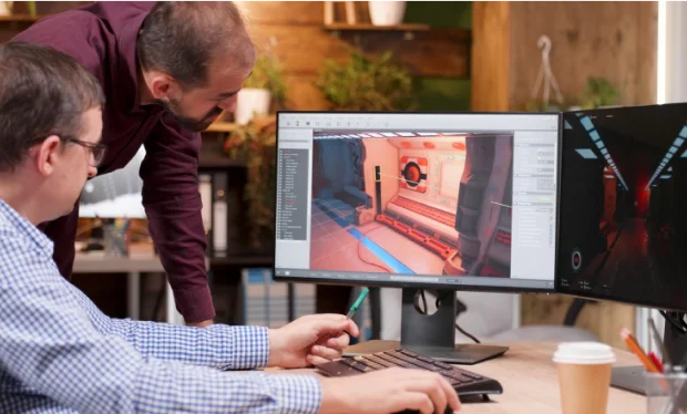
upgrade & up skill with our industry standard courses
Proudly Associated with
Trusted Partners


5
4
3
2
1
- 4.8

2,030 reviews
Sort by
Simplify Learning with Milestone Your Trusted Education Partner
At Milestone, We are committed to providing a complete education solution in Thane. Our mission, values, and key principles shape our behavior to allow us to continually provide a high-quality, hassle-free education experience for our Accredited Partner Centres and students.
Know moreDiscover Lifelong Learning with Curated Masterclasses
-
 AI Integrated Curriculum
Masters In Data Analysis and Data Science with AI
 4.5 / 5
 1500+ Reviews
 Placement Assistance
- Practical Training
- Expert Faculty
- MIT Certification
 32 Weeks
 Advance
 50+ Active Learners
-
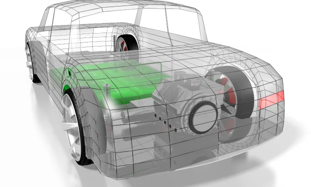
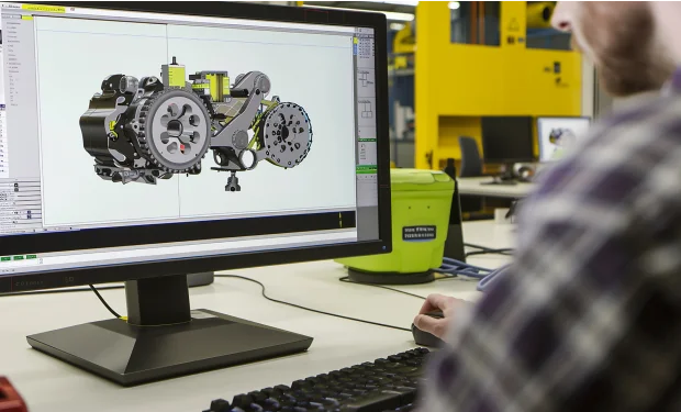 Engineering the Future with Precision
Masters In Product Design & Analysis
- 4.5 / 5
- 1500+ Reviews
- 100% Job Guarantee
- Practical Training
- Expert Faculty
- Govt. Certification
- 32 Weeks
- Advance
- 120+ Active Learners
-
 Designing Tomorrow's Infrastructure Today
Masters in Civil Design
- 4.5 / 5
- 1500+ Reviews
- 100% Job Guarantee
- Practical Training
- Expert Faculty
- Govt. & Autodesk Certification
- 32 Weeks
- Advance
- 130+ Active Learners
-
 Innovative Designs for Modern Living
Masters in Interior Design
- 4.5 / 5
- 1500+ Reviews
- 100% Job Guarantee
- Practical Training
- Expert Faculty
- MIT Certification
- 32 Weeks
- Advance
- 100+ Active Learners
-
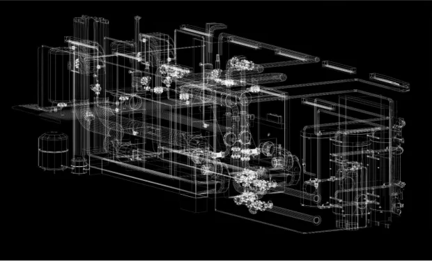
 Driving Industrial Progress through Automation
Masters in Industrial Automation
- 4.5 / 5
- 1500+ Reviews
- 100% Job Guarantee
- Practical Training
- Expert Faculty
- MIT Certification
- 24 Weeks
- Advance
- 100+ Active Learners
-
 Crafting Architectural Masterpieces
Masters in Architectural BIM
- 4.5 / 5
- 1500+ Reviews
- 100% Job Gaurantee
- Practical Training
- Expert Faculty
- Govt. & Autodesk Certification
- 36 Weeks
- Advance
- 110+ Active Learners
-
 Your First step in AI
Python Programming
- 4.5 / 5
- 1500+ Reviews
- Placement Assistance
- Practical Training
- Expert Faculty
- MIT Certification
- 6 Weeks
- Foundation
- 75+ Active Learners
-
 Innovate with Data, Lead with Knowledge
Python Programming With Data Science
- 4.5 / 5
- 1500+ Reviews
- Placement Assistance
- Practical Training
- Expert Faculty
- MIT Certification
- 8 Weeks
- Advance
- 100+ Active Learners
-
 Transforming Data into Decisions
PG in data Analytics
- 4.5 / 5
- 1500+ Reviews
- Placement Asistance
- Practical Training
- Expert Faculty
- MIT Certification
- 24 Weeks
- Advance
- 90+ Active Learners
-
 Empowering the Future with Data
PG in Data Science with AI & ML
- 4.5 / 5
- 1500+ Reviews
- Placement Asistance
- Practical Training
- Expert Faculty
- MIT Certification
- 24 Weeks
- Advance
- 80+ Active Learners
-
 Transition to Technical World
Mechanical Draughtsman
- 4.5 / 5
- 1500+ Reviews
- Placement Assistance
- Practical Training
- Expert Faculty
- MIT Certification
- 12 Weeks
- Foundation
- 10+ Active Learners
-
 Engineering Precision, Designing Excellence
AutoCAD Mechanical
- 4.5 / 5
- 1500+ Reviews
- Placement Asistance
- Practical Training
- Expert Faculty
- Govt. & Autodesk Certification
- 8 Weeks
- Foundation
- 550+ Active Learners
-
 Designing Tomorrow's Machines Today
Solidworks
- 4.5 / 5
- 1500+ Reviews
- Placement Asistance
- Practical Training
- Expert Faculty
- Govt. & Autodesk Certification
- 8 Weeks
- Foundation
- 300+ Active Learners
-
 Innovative Engineering for Modern Challenges
NX
- 4.5 / 5
- 1500+ Reviews
- Placement Asistance
- Practical Training
- Expert Faculty
- Govt. Certification
- 8 Weeks
- Foundation
- 230+ Active Learners
-
 Engineering the Future with Precision
Catia
- 4.5 / 5
- 1500+ Reviews
- Placement Assistance
- Practical Training
- Expert Faculty
- Govt. Certification
- 8 Weeks
- Foundation
- 175+ Active Learners
-
 Innovate, Design, Create
Creo
- 4.5 / 5
- 1500+ Reviews
- Placement Assistance
- Practical Training
- Expert Faculty
- Govt. Certification
- 8 Weeks
- Foundation
- 150+ Active Learners
-
 Building the Future with Mechanical Mastery
Inventor
- 4.5 / 5
- 1500+ Reviews
- Placement Assistance
- Practical Training
- Expert Faculty
- Govt. Certification
- 8 Weeks
- Foundation
- 125+ Active Learners
-
 Mechanical Minds, Creative Designs
Fusion360
- 4.5 / 5
- 1500+ Reviews
- Placement Assistance
- Practical Training
- Expert Faculty
- Govt. Certification
- 8 Weeks
- Foundation
- 100+ Active Learners
-
 Precision Engineering for Tomorrow's Challenges
Revit MEP BIM
- 4.5 / 5
- 1500+ Reviews
- Placement Assistance
- Practical Training
- Expert Faculty
- Govt. Certification
- 8 Weeks
- Foundation
- 425+ Active Learners
-
 Building Strong Foundations for the Future
Ansys
- 4.5 / 5
- 1500+ Reviews
- Placement Assistance
- Practical Training
- Expert Faculty
- MIT Certification
- 8 Weeks
- Intermediate
- 65+ Active Learners
-
 Crafting Solutions with Mechanical Ingenuity
GD&T
- 4.5 / 5
- 1500+ Reviews
- Placement Assistance
- Practical Training
- Expert Faculty
- MIT Certification
- 2 Weeks
- Foundation
- 200+ Active Learners
-
 Transition to Technical World
Architectural Draughtsman
- 4.5 / 5
- 1500+ Reviews
- Placement Assistance
- Practical Training
- Expert Faculty
- MIT Certification
- 12 Weeks
- Foundation
- 300+ Active Learners
-
 Precision in Every Plan
AutoCAD Architecture
- 4.5 / 5
- 1500+ Reviews
- Placement Asistance
- Practical Training
- Expert Faculty
- Govt. Certification
- 8 Weeks
- Foundation
- 220+ Active Learners
-
 Design Your Dream Interiors
Sketchup
- 4.5 / 5
- 1500+ Reviews
- Placement Asistance
- Practical Training
- Expert Faculty
- MIT Certification
- 2 Weeks
- Foundation
- 175+ Active Learners
-
 Building the World, One Design at a Time
Revit Architecture
- 4.5 / 5
- 1500+ Reviews
- Placement Asistance
- Practical Training
- Expert Faculty
- Govt. & Autodesk Certification
- 8 Weeks
- Foundation
- 150+ Active Learners
-
 Crafting Beauty in Every Corner
3Ds Max
- 4.5 / 5
- 1500+ Reviews
- Placement Assistance
- Practical Training
- Expert Faculty
- Autodesk Certification
- 8 Weeks
- Foundation
- 125+ Active Learners
-
 Render Your Dreams with perfection
Vray
- 4.5 / 5
- 1500+ Reviews
- Placement Assistance
- Practical Training
- Expert Faculty
- MIT Certification
- 2 Weeks
- Foundation
- 100+ Active Learners
-
 Where Creativity Meets Functionality
Lighting Design
- 4.5 / 5
- 1500+ Reviews
- Placement Assistance
- Practical Training
- Expert Faculty
- MIT Certification
- 6 Weeks
- Advance
- 90+ Active Learners
-
 Designing Efficiency, Engineering Success
Navisworks
- 4.5 / 5
- 1500+ Reviews
- Placement Assistance
- Practical Training
- Expert Faculty
- Autodesk Certification
- 8 Weeks
- Intermediate
- 50+ Active Learners
-
Transforming Spaces, Inspiring Lives
Civil Draughtsman
- 4.5 / 5
- 1500+ Reviews
- Placement Assistance
- Practical Training
- Expert Faculty
- MIT Certification
- 12 Weeks
- Foundation
- 300+ Active Learners
-
Precision in Every Plan
AutoCAD Civil
- 4.5 / 5
- 1500+ Reviews
- Placement Asistance
- Practical Training
- Expert Faculty
- Govt. & Autodesk Certification
- 8 Weeks
- Foundation
- 210+ Active Learners
-
 Designing the Foundations
Revit Structure
- 4.5 / 5
- 1500+ Reviews
- Placement Asistance
- Practical Training
- Expert Faculty
- Autodesk Certification
- 8 Weeks
- Foundation
- 175+ Active Learners
-
 Innovative Designs for Robust Infrastructure
Tekla
- 4.5 / 5
- 1500+ Reviews
- Placement Asistance
- Practical Training
- Expert Faculty
- MIT Certification
- 8 Weeks
- Foundation
- 150+ Active Learners
-
 Engineering Stability, Designing Strength
Staad Pro
- 4.5 / 5
- 1500+ Reviews
- Placement Asistance
- Practical Training
- Expert Faculty
- MIT Certification
- 8 Weeks
- Foundation
- 135+ Active Learners
-
 Shaping the World with Structural Excellence
Etab
- 4.5 / 5
- 1500+ Reviews
- Placement Asistance
- Practical Training
- Expert Faculty
- MIT Certification
- 8 Weeks
- Foundation
- 100+ Active Learners
-
Precision in Every Plan
Interior Draughtsman
- 4.5 / 5
- 1500+ Reviews
- Placement Assistance
- Practical Training
- Expert Faculty
- MIT Certification
- 12 Weeks
- Foundation
- 300+ Active Learners
-
Bringing Interiors to Life
AutoCAD Interior
- 4.5 / 5
- 1500+ Reviews
- Placement Assistance
- Practical Training
- Expert Faculty
- Govt. & Autodesk Certification
- 8 Weeks
- Foundation
- 230+ Active Learners
-
 Design Your Dream Interiors
Sketchup
- 4.5 / 5
- 1500+ Reviews
- Placement Assistance
- Practical Training
- Expert Faculty
- MIT Certification
- 2 Weeks
- Foundation
- 80+ Active Learners
-
Crafting Beauty in Every Corner
3Ds Max
- 4.5 / 5
- 1500+ Reviews
- Placement Assistance
- Practical Training
- Expert Faculty
- Autodesk Certification
- 8 Weeks
- Foundation
- 120+ Active Learners
-
Render Your Dreams with perfection
Vray
- 4.5 / 5
- 1500+ Reviews
- Placement Assistance
- Practical Training
- Expert Faculty
- MIT Certification
- 2 Weeks
- Foundation
- 80+ Active Learners
-
 Revolutionizing Industry with Automation
Electrical AutoCAD
- 4.5 / 5
- 1500+ Reviews
- Placement Assistance
- Practical Training
- Expert Faculty
- Govt. & Autodesk Certification
- 8 Weeks
- Foundation
- 100+ Active Learners
-
 Innovate, Automate, Elevate
PLC Scada
- 4.5 / 5
- 1500+ Reviews
- Placement Asistance
- Practical Training
- Expert Faculty
- MIT Certification
- 8 Weeks
- Foundation
- 120+ Active Learners
-
 Precision Automation for a Smarter Future
E-Plan
- 4.5 / 5
- 1500+ Reviews
- Placement Asistance
- Practical Training
- Expert Faculty
- MIT Certification
- 2 Weeks
- Foundation
- 100+ Active Learners
-
 The Next Generation of Automation
HMI
- 4.5 / 5
- 1500+ Reviews
- Placement Asistance
- Practical Training
- Expert Faculty
- MIT Certification
- 2 Weeks
- Foundation
- 100+ Active Learners
-
 Empowering Industry through Intelligent Automation
MCC & VFD
- 4.5 / 5
- 1500+ Reviews
- Placement Asistance
- Practical Training
- Expert Faculty
- MIT Certification
- 2 Weeks
- Foundation
- 90+ Active Learners
-
 Design Your Imagination
Adobe Photoshop
- 4.5 / 5
- 1500+ Reviews
- Placement Asistance
- Practical Training
- Expert Faculty
- MIT Certification
- 8 Weeks
- Foundation
- 100+ Active Learners
-
 Where Creativity Meets Technology
Indesign
- 4.5 / 5
- 1500+ Reviews
- Placement Asistance
- Practical Training
- Expert Faculty
- MIT Certification
- 8 Weeks
- Foundation
- 90+ Active Learners
-
 Artistry Meets Innovation
Adobe Illustrator
- 4.5 / 5
- 1500+ Reviews
- Placement Asistance
- Practical Training
- Expert Faculty
- MIT Certification
- 8 Weeks
- Foundation
- 90+ Active Learners
-
 Transforming Ideas into Art
Coreldraw
- 4.5 / 5
- 1500+ Reviews
- Placement Asistance
- Practical Training
- Expert Faculty
- MIT Certification
- 8 Weeks
- Foundation
- 100+ Active Learners


Trace your own path with
Milestone
Milestone is here to guide you on your path to a successful career
Enroll for a free demo-
 01
01
Call For Enquiry
Call us to schedule your visit and discover our campus firsthand.
-
 02
02
Attend demo class
Attend a demo class and experience our teaching excellence.
-
03

Enrollment
Enroll in the course of your choice and begin your journey with us.
-
04

Projects
Work on industry-standard projects to build real-world expertise.
-
05

Interviews
Attend job interviews with top companies to launch your career.
-
06

Jobs
Secure your dream job in your field of expertise.
Why Choose  ?
?
At Milestone, we make learning effortless and effective. As your trusted education partner, we provide top-notch technical training and personalized support, ensuring every student is job-ready. Our commitment to excellence ensures that every student receives the highest quality education and support. As one of the top CAD, BIM & IT software training institutes, we're dedicated to provide our students with an exceptional learning experience.
Register NowTop companies and brands look forward to
working with our students
-
Enrolling at MIT was a game-changer for me. I secured a job placement in just 8 months!
Ameya Rasam
-
I Joined MIT for Master's on my friend's suggestion, and it was the best decision i ever made.
Pratik Dubal
-
Personal Training from experienced faculty helped me to gain proper knowledge and skills.
Nikita Akhade
-
I got exactly what I needed, a fantastic learning experience with live industrial projects.
Nikita Shelar
Our students are placed in Top companies
Milestone Institute is committed to turning your academic education into a thriving career. With our master diploma courses, you'll receive personalized placement support and benefit from strong industry connections. Our dedicated team ensures you land a position at top companies, setting you up for future-ready success.
Learn More-

Abhay
-

Akshay
-

Vikrant
-

Anchal
-

Chetan Jadhav
-

Durga
-

Deepak
-

Amogh
-

Hemant
-

Ishan
-

Farhan
-

Jatin
-

Achal
-

Jeeshan
-

Kundan
-

Omkar
-

Pankaj
-

Pritam
-

Siddharth
-

Abhijit
-

Shweta
-

Saurabh
-

Sameer
-

Akshay
Course Curators
Get to know our dedicated team members who are here to support
your learning journey.
-

Sayali Jadhav
Tech Lead - Accenture
10+ years of experience in designing and implementing complex IT technical solutions for customers in Healthcare domains. Expertise in various OOTB features, customisations and Integrations with external systems.

-

Naynesh Belhekar
Head Mechanical Design - Pennsylvania Transformer Technology Inc.
Accomplished professional with 19+ years of experience in product design, project leadership, and lifecycle management for Large Power Transformers and Shunt Reactors, adhering to national and international standards.
-

Rishikesh Sawant
Project Manager - Milestone PLM Solutions Pvt Ltd
Having 10+ years of experience in handing various AEC/BIM projects both in India & US market. His diverse experience is from Architectural, Structural & MEP projects covering commercial, residential and Industrial portfolio.
-

Rajesh Gawade
Head Design & Development Application Engineering -ACG World
Postgraduate in M.Tech from BITS Pilani with 22 years of experience in industrial packaging, material handling, and automation, specializing in cutting-edge Automation solutions.


to a whole new level?
